2027 Colors of the Year From Paint and Building Product Makers
Story at a Glance:
- This year's picks emphasize wellness, balance, and emotional clarity, reflecting homeowner priorities.
- Warm earth tones such as terracotta orange and olive green are popular this year for creating authentic space.
- Designers are integrating colors with organic textures and warm materials to create calmer, more grounded surroundings.
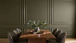
Updated October 7, 2026: Added C2 Paints' pick.
As residential design sees a greater shift toward wellness, clients are increasingly opting for color that feels warm and rooted in the natural world. The trend has been moving this way for the past several years, and 2027 Color of the Year announcements have made it much more obvious.
So far, manufacturers have chosen earthy greens, a terracotta orange, a deep brown, and an earthy mauve, along with various blues. We'll add picks to this list as more brands announce.
A Soft Herbal Green: Sherwin-Williams
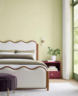
Sherwin-Williams' pick manages to feel both energized and calming. The soft, herbal shade is known as Celery and features a warm yellow undertone paired with an electric green overtone. The balance between these two ideas was key, according to the company.
"Celery was chosen as the 2027 Color of the Year because it reflects today's priorities: wellness, balance, and connection," says Ashley Banbury, color marketing manager at Sherwin-Williams. "Homeowners and designers are increasingly prioritizing wellness at home, seeking soothing environments that support mental health and overall well‑being."
The shade also pairs well with several other earthy neutrals from Sherwin-Williams, including White Flour, Artichoke, Cocoon, and Plum Brown.
A Calming Shade of Blue: Valspar
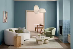
Valspar’s 2027 pick for Color of the Year reflects the growing interior trend toward warm, cottage-inspired spaces. The shade, Cottage Door, is a mid-tone neutral blue that the company describes as “authentically lived-in” and “quietly confident.”
"This mid-tone neutral blue is reflective and warm, with a timeless appeal that feels personal and grounding," says Sue Kim, director of color marketing at Valspar. "Cottage Door captures blue's natural sense of security and trust while serving as a colorful new neutral that layers effortlessly into the home."
According to the company, Cottage Door pairs well with Valspar’s Moon Shot, a soft, warm-toned gray, and Valspar’s Apricot Blush, a soft, creamy shade of pink.
A Burnt Orange: Dutch Boy
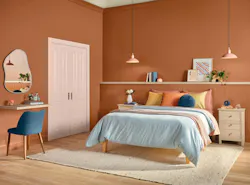
Deep Rooted from Dutch Boy Paints, a terracotta orange, takes inspiration from the natural world. The color is designed to evoke both authenticity and emotional clarity, according to the company, and pairs with three Dutch Boy color palettes: the Essence Palette, Bliss Palette, and Clarity Palette.
"Deep Rooted offers a color that feels rich, grounding, and deeply human. Its earthy orange tone creates a versatile foundation for spaces that celebrate individuality through bold contrasts and layered textures," says Lisbeth Parada, color marketing manager for Dutch Boy Paints.
A Deep, Smoky Blue : Glidden
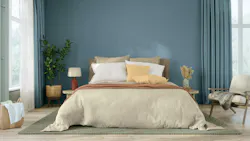
Glidden also selected a shade of blue for their color of the year, but unlike Valspar's Cottage Door, Artifact is a deep shade of blue. While smoky and warm, the color is far from dramatic. According to the company, the shade works as a reset for the home, blending into the background and allowing the homeowners' personality to seep through.
“Consumers today want color that feels like their call, not a design rule. A smoky blue like Artifact behaves like a modern ‘choose your own adventure’ color that doesn’t force a story or a specific design style onto you, says Ashley McCollum, Glidden's paint color marketing manager. "It lets you shape your own story depending on what you choose to pair it with.”
A Deep, Earthy Olive: Behr
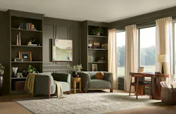
Because of its dual tones, the color pairs well with a variety of shades as well as organic textures, warm woods, and other natural materials.
A Soulful Green: AkzoNobel Coil and Extrusion Coatings
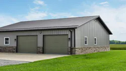
AkzoNobel Coil and Extrusion Coatings, whose finishes are applied to metal roofing, siding, window frames, and appliances, chose a color of the year that reflects the same trend as Behr’s Grounded. Their color, Soulful Sage, is described by the coil and extrusion coatings manufacturer as an “ethereal, soft, and silvery green.”
However, the color does more than reflect a trend, says Henri Bijsterbosch, color product marketing manager for AkzoNobel’s industrial coatings business.
“It must work across specifications, production and end use. Soulful Sage, and the wider 2027 palette, has been designed to offer inspiration for customers to transfer contemporary color direction into construction and domestic appliance applications which fit with interior schemes," he says. "Architects, fabricators, and coaters will find the color stories especially useful for achieving a timeless yet on-trend aesthetic."
A Deep, Moody Blue: California Paints
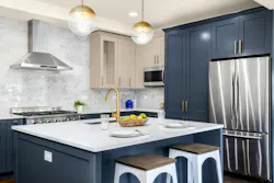
California Paints' 2027 Color of the Year, Quiet Peace, is a deep, moody blue meant to evoke a cocooning effect in interior spaces.
"It reflects where consumers are in today's environment," says Dani Doerge, marketing manager at California Paints. "It's the perfect color for a moment where blues are emerging across interiors, fashion, and other design trends."
The coordinating palette ranges from soft browns, beiges, and greens, such as Coffee Shop and French Pear, to dusty pinks and brighter yellows, including Sassy Yellow.
A Deep Plum-Tinged Brown: Dunn-Edwards
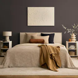
Dunn-Edwards' pick, French Press Coffee, is a deep brown that, the company says, is a shift away from the cool grays, stark whites, and flat beiges of recent years toward warmer, earthier hues.
"As light shifts throughout the day, its subtle plum undertone emerges, adding complexity you don't always see in a neutral," says Lauren Hoferkamp, color marketing manager at Dunn-Edwards.
The company recommends it for all four walls of smaller rooms like powder rooms and studies, and for fireplace surrounds, interior doors, trim, and cabinetry in larger spaces. On exteriors, Dunn-Edwards positions it as an alternative to black on front doors, shutters, garages, and trim. It pairs with earthy greens, clay tones, and soft creams.
An Earthy Mauve: C2 Paints
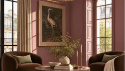
C2 Paint's selection, Pueblo, is an earthy mauve that sits somewhere between a pink and terracotta. In daylight, it appears rosy, the brand says, but at night it shifts deeper, more "earthen."
"The color itself behaves almost like something living in the landscape," says Philippa Radon, color consultant at C2 Paint. "It changes with its environment."
The brand recommends it for dining rooms, kitchens, and entries, or on cabinetry, front doors, and other architectural details. Its sits well next to textured materials like wood, stone, and plaster. The coordinating palette, dubbed Rural Renaissance, includes a deep brown, a soft muted green, and a bright peach.
Related Reads:
 Bathroom
 Installing a Honeywell whole home humidifier
 True Residential's Undercounter Refrigerator
About the Author
Catherine Sweeney
Catherine Sweeney is the associate editor for Pro Builder and Custom Builder, where she creates both digital and print content, including Pro Builder’s daily e-newsletter and various news stories for both brands. Before joining Endeavor, she began her career in local journalism, later pivoting to the commercial real estate industry where she worked for several years as a reporter and editor.
Pauline Hammerbeck
Head of Content
Pauline Hammerbeck is head of content at Custom Builder, where she covers custom home building for builders, architects, and designers. She is also senior content strategist at Pro Builder, where she directs the brand's MVP Product Awards, and co-produces the Women in Residential Construction podcast, newsletter, and conference. Her background includes work in architecture, real estate, retail, and design.